
In this post, I provide a primer on geospatial analytics and its common tools & techniques. My intention in writing this post is to help the reader get a sufficient understanding of geospatial data science techniques so that they can more fully appreciate my analysis in “Airbnb Price Analytics”. After reading this post, the reader should be able to understand the basic theory and fundamentals underlying geospatial data science.
1. Introduction
Geospatial data science is a subset of data science. It’s where data science intersects with geographic information systems (GIS) with a key focus on geospatial data and new computing techniques. [ref] As a result, location information is treated as a first class entity during the data analysis process. Consequently, various traditional data science techniques have to be re-imagined to fit the geospatial context and our existing data science toolbox has to be augmented with additional techniques.
In the below sections section, I will provide a brief overview of some of the core techniques, beginning with coordinate reference systems and wrapping up with hotspot analysis & autocorrelation. Each of these techniques is then implemented with real-world Airbnb data in “Airbnb Pricing Analytics”.
2. Coordinate Reference Systems & Projections
2.1 Projection
A map projection is a method by which cartographers translate a sphere or globe into a two-dimensional representation. In other words, a map projection systematically renders a 3D ellipsoid (or spheroid) of Earth to a 2D map surface.(https://gisgeography.com/map-projections/#what-are-map-projections)
Selecting a map projection is a critical part of a geographic data analytics project as each map projection has its own unique benefits and drawbacks for the area under consideration.
Some common projections include the Lambert Conformal Conic and the Universal Transverse Mercator.
2.2 Coordinate Reference Systems
When discussing geographic data, it is critical to define a coordinate reference system (CRS). A coordinate reference system (CRS) is a coordinate-based local, regional or global system used to locate geographical entities. (https://www.earthdatascience.org/courses/earth-analytics/spatial-data-r/intro-to-coordinate-reference-systems/)
In an unprojected (spherical) coordinate system, the units of measurement are in degrees (longitude, latitude). A ordered pair of long-lat coordinates are used to pinpoint a location on the Earth’s surface. Meanwhile, in a projected (planar) coordinate system, the units of measurement are linear (i.e. meters, feet, etc.).
Distance measurements have to be modified depending on the coordinate system in use. In particular, in an unprojected (spherical) CRS, it is necessary to use great circle distance calculations like the Haversine formula. The Haversine formula determines the great circle distance between two points on a sphere given their longitude and latitude. However, in a projected (flat) coordinate system, it is sufficient to use the standard Euclidean distance formula.
The European Petroleum Survey Group (EPSG) maintains a dataset of various CRS known as the EPSG Geodetic Parameter Dataset. As a result, each CRS is often referred to by its EPSG code. For example, the EPSG code “EPSG: 4326” refers to the World Geodetic System 1984 (WGS84), which is the CRS used in GPS (Global Positioning System). It is a spherical CRS.
3. Exploratory Spatial Data Analysis
In traditional data science, Exploratory Data Analysis (EDA) helps data scientists understand their data better: data types, summary statistics, data distributions, outliers, and visualizations. It is an open-ended exploration, where a data scientist asks a question of the data, and then analyzes it to develop a response. A similar process is necessary for spatial data; however, a few additional techniques are needed to handle the spatial characteristics of the data.
3.1 Choropleth Maps
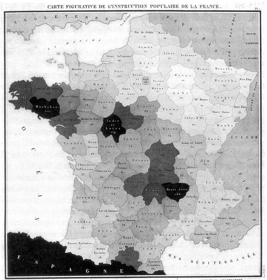
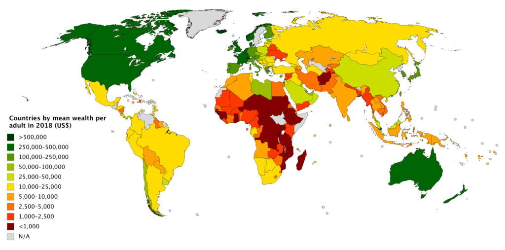
Choropleth maps are a workhorse of statistical visualization for geographic data. A choropleth map is an excellent way to visually identify broad patterns in how a quantitative variable varies across pre-defined geographic regions. It involves coloring each region of a map by mapping a quantitative variable to a color scale.
3.2 Spatial Operations
Spatial Union
Similar to a union between two sets, a spatial union is an aggregation of two spatial regions.
Spatial Difference
Similar to a set difference, a spatial difference takes a region and subtracts it from another region.
Spatial Join
A spatial join is analogous to a regular tabular data join between two tables. For a tabular (inner) join, whenever two records share the same join key, they are included in the result set. Similarly, whenever two spatial points (or a spatial point and a region) share the same spatial region, they are included in the result set. Similar to tabular joins, we can have inner, right, and left spatial joins.
4. Spatial Autocorrelation
Autocorrelation measures how much information about a given random variable is provided by different versions of the same variable. Those “different versions” of the same variable might be values of the same variable at previous points in time (i.e. temporal autocorrelation); or, of greater relevance to our case, they might be values of the variable at nearby locations (i.e. spatial autocorrelation).
In other words, “spatial autocorrelation relates the value of the variable of interest in a given location, with values of the same variable in other locations. An alternative way to understand the concept is as the degree of information contained in the value of a variable at a given location about the value of that same variable in other locations.” (https://geographicdata.science/book/notebooks/06_spatial_autocorrelation.html#)
4.1. Global Spatial Autocorrelation
Global spatial autocorrelation, on which this chapter is focused on, considers the overall trend that the location of values follows. In doing this, the study of global spatial autocorrelation makes possible statements about the degree of clustering in the dataset. Do values generally follow a particular pattern in their geographical distribution? Are similar values closer to other similar values than we would expect from pure chance? These are some of the questions that relate to global spatial autocorrelation. Local autocorrelation focuses on deviations from the global trend at much more focused levels than the entire map.
Global spatial autocorrelation can have a positive or a negative sign. The former relates to a situation where similarity and geographical closeness go hand-in-hand. In other words, similar values are located near each other, while different values tend to be scattered and further away. In contrast, negative spatial autocorrelation reflects a situation where similar values tend to be located away from each other. In this case, statistical similarity is associated with distance. [ref]
Moran’s Global I
The most commonly used measure of global autocorrelation is the Global Moran’s I. It is computed as follows.

In the above, n represents the number of observations, w_ij represents the weight assigned to i’s jth neighbor, z_j represents the value of the variable at location j.
Moran Plot
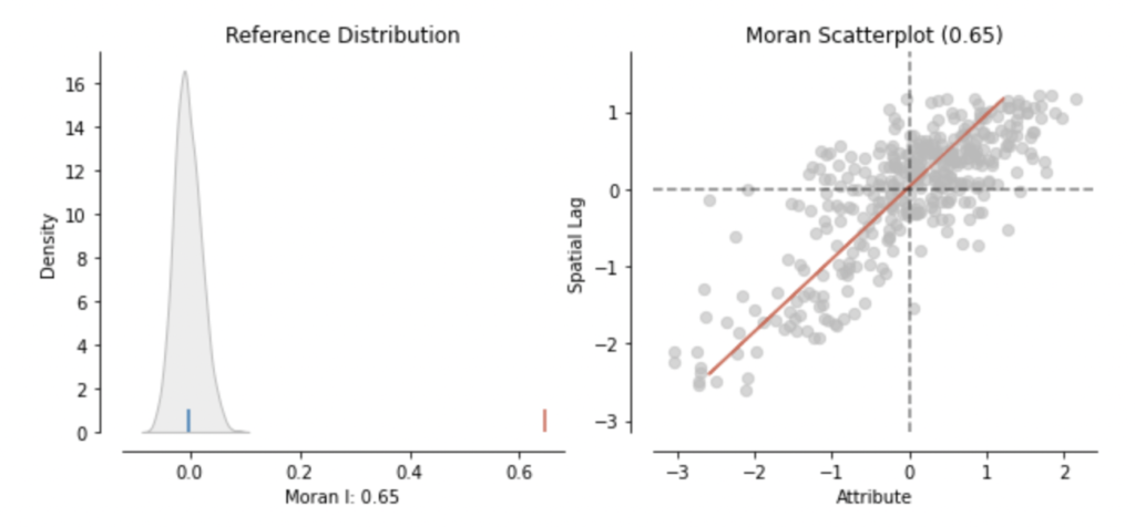
The Moran Plot is a way of visualizing a spatial dataset to explore the nature and strength of spatial autocorrelation. It is essentially a traditional scatter plot in which the variable of interest is displayed against its spatial lag. In order to be able to interpret values as above or below the mean, the variable of interest is usually standardized by subtracting its mean. A variables’s spatial lag is computed using the below formula:
I interpret the spatial lag as a variable’s value at a given location computed by “polling” the variable’s neighbors’ values. In other words, the spatial lag is the variable’s value computed using its neighbors’ values.
The Moran Plot is then a scatterplot of the variables spatial lag plotted against the variable’s standardized value. The value of Moran’s I corresponds with the slope of the linear fit overlayed on top of the Moran Plot.
4.2 Local Spatial Autocorrelation
Local Moran’s I Statistic
The Local Moran’s I statistic is a local version of the Global Moran’s I discussed above. It is computed for each location in the dataset, and then its value is then plotted on a choropleth map.

zi is the variable under consideration at location i, wij is the weight location i assigns to neighbor j, m2 is the second moment of the zi, and n is the number of observations.
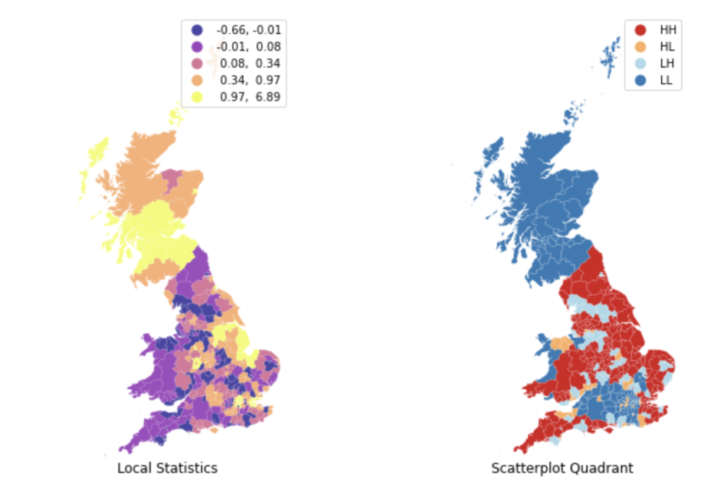
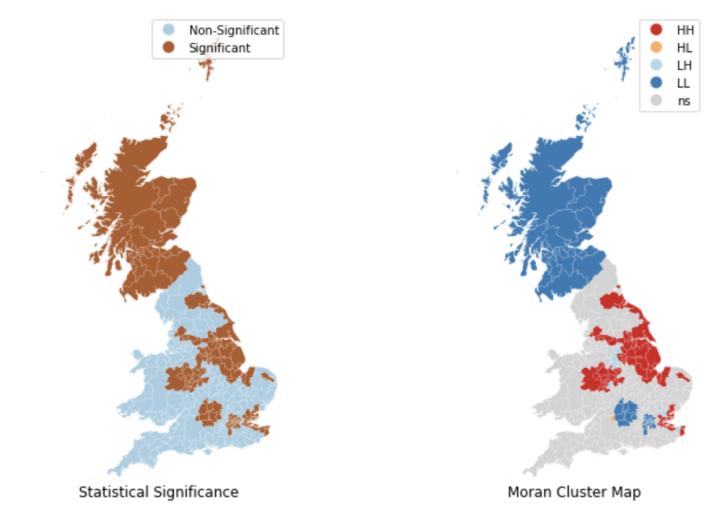
Local Moran’s I is used to identify areas of high spatial autocorrelation. However, sometimes, it is not just important to distinguish areas of high autocorrelation from areas of low autocorrelation, but also to distinguish areas with low variable values surrounded by a neighborhood of low values, and similarly, areas with high variable values surrounded by a neighborhood of high values. To that extents, it is necessary to distinguish points by where they fall on the four quadrants of the Moran plot.
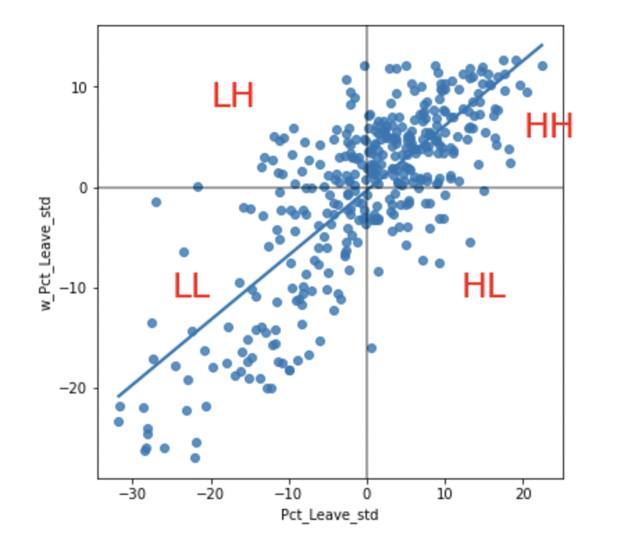
A choropleth map visualizing a point’s quadrant location, significance value, and spatial lag often help in this regard. For example, in the below plots (taken from the textbook “Geographic Data Science with Python“) the Leave % by Local Authority District (LADs) is analyzed for European Union Referendum conducted in the United Kingdom.
Getis-Ord Statistic & Hotspot Analysis
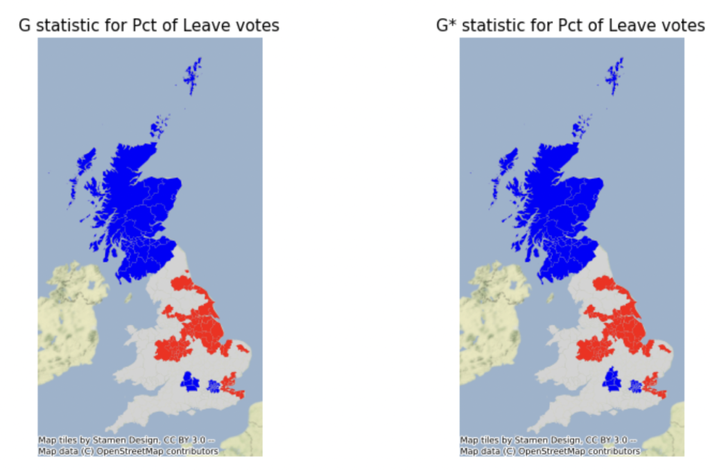
Similar to the Local Moran I, the Getis-Ord Gi statistic computes an autocorrelation statistic for each site. However, Getis-Ord Gi differs from Local Moran’s I in that Getis-Ord only allows for identification of positive autocorrelation. When standardized, positive values imply clustering of high values, while negative implies grouping of low values.
While the Local Moran’s I statistic is used to identify a site’s outlier/cluster status, the Getis-Ord Gi statistic is used to identify which side of the hotspot/cold spot divide a cluster lies on. As a result, we can use the Gi statistics to conduct a hotspot analysis. A hotspot analysis involves identification of clusters with high variable values (“hot spots”), and clusters of variables with low values (“cold spots”). In the below plot taken from “Geographic Data Science with Python“, a hotspot analysis is conducted for % Leave data by Local Authority District (LAD) data from the EU referendum conducted in the UK.
5. Conclusion
In this post, we have surveyed some of the key techniques of geospatial data science. We began with the fundamentals of projections & coordinate reference systems and then transitioned to exploratory spatial data analysis (ESDA), before wrapping up with spatial autocorrelation techniques. After reading this post, the reader should hopefully be able to develop a deeper understanding of the techniques used in Airbnb Price Analytics.