In a Nutshell
Who: Business looking to incorporate geographic inputs into market entry decisions, startups, geospatial data scientists, marketing executives
WHY: In business situations where geographic information plays a key role in decision making, an understanding of geospatial analytics techniques is critical.
HOW: Geospatial Analytics, Hotspot Analysis, Spatial Autocorrelation, Geographic Clustering, Satellite Imaging, Census Data, Open Street Maps roadway network data
IMPACT: New market entrants looking to incorporate geospatial analytics into their decision-making now have a blueprint for data sources to consider and sample analyses to carry out.
This project was a final assignment for a Geospatial Analytics course I recently took. Our assignment involved taking a public dataset and analyzing it using geospatial techniques to answer a set of pre-defined business questions. The objective was educational and was designed to give us hands-on practice with various geospatial data science techniques. By reading this post, you can get an idea of what these techniques look like in action. For a brief primer on the core techniques of geospatial analytics, please feel free to refer to this project’s companion post here: Geospatial Data Science: A Primer.
1. Introduction & Business Context

The below business context is purely hypothetical and was provided in the assignment pre-amble.
“You have been engaged by a short-term home rental service startup who have launching a new product in Southern California. They trust you to help them get off the ground successfully and have asked for help in developing a pricing model for their service. A key component of that analysis is understanding the variation in prices across an existing service, AirBnB, and the features that might impact those prices. The startup (“the client”) has provided data from San Diego County for this work. You are the geospatial expert on the team and have been specifically asked to explore the following data.”
2. Dataset
My main dataset consisted of Airbnb listings in the San Diego County area in 2022. I then augmented this dataset with supplementary datasets from the following sources:
- Census Tract Shapefiles from the U.S. Census Bureau
- Data for each tract from the 2020 Decennial Census and the American Community Survey
- Open Street Maps Road network data
- Satellite image data from Landsat 8 – OLI
3. Data Ingestion
In this step, we will ingest all the data sources we are using for the project. These are:
- Airbnb Listing Data
- Census Tract Data
- U.S. Census Data
- Open Street Maps Data
- Satellite Data (fill in later)
3.1 Listings
The Airbnb listings data represents Airbnb listings from San Diego County. Each row represents a listing, and the columns represent attributes of each listing.
A complete data dictionary is available here; however, the subset of columns we selected have their meanings listed below for easy reference.
- id: Airbnb’s unique identifier for the listing
- name: Name of the listing
- host_id: Airbnb’s unique identifier for the host/user
- host_name: Host’s first name
- neighborhood: which neighborhood the listing is located in?
- room_type: Type of room (can be entire home/apt, Private room, Shared room, Hotel)
- price: Daily price in local currency
- minimum_nights: minimum number of night stay for the listing (calendar rules may be different)
- number_of_reviews: how many reviews the listing has?
- last_review: the date of the last/latest review?
- reviews_per_month: the number of reviews the listing has over the lifetime of the listing
- last_review:the date of the last/latest review?
- reviews_per_month:the number of reviews the listing has over the lifetime of the listing
- calculated_host_listings_count:The number of listings the host has in the current scrape, in the city/region geography.
- availability_365: The availability of the listing 365 days in the future as determined by the calendar. Note a listing may not be available because it has been booked by a guest or blocked by the host.
- number_of_Reviews_ltm: The number of reviews the listing has (in the last 12 months)
- license: The licence/permit/registration number
- geometry: The location of the listing as a Shapely geometry object
3.2 Tract Shape Files
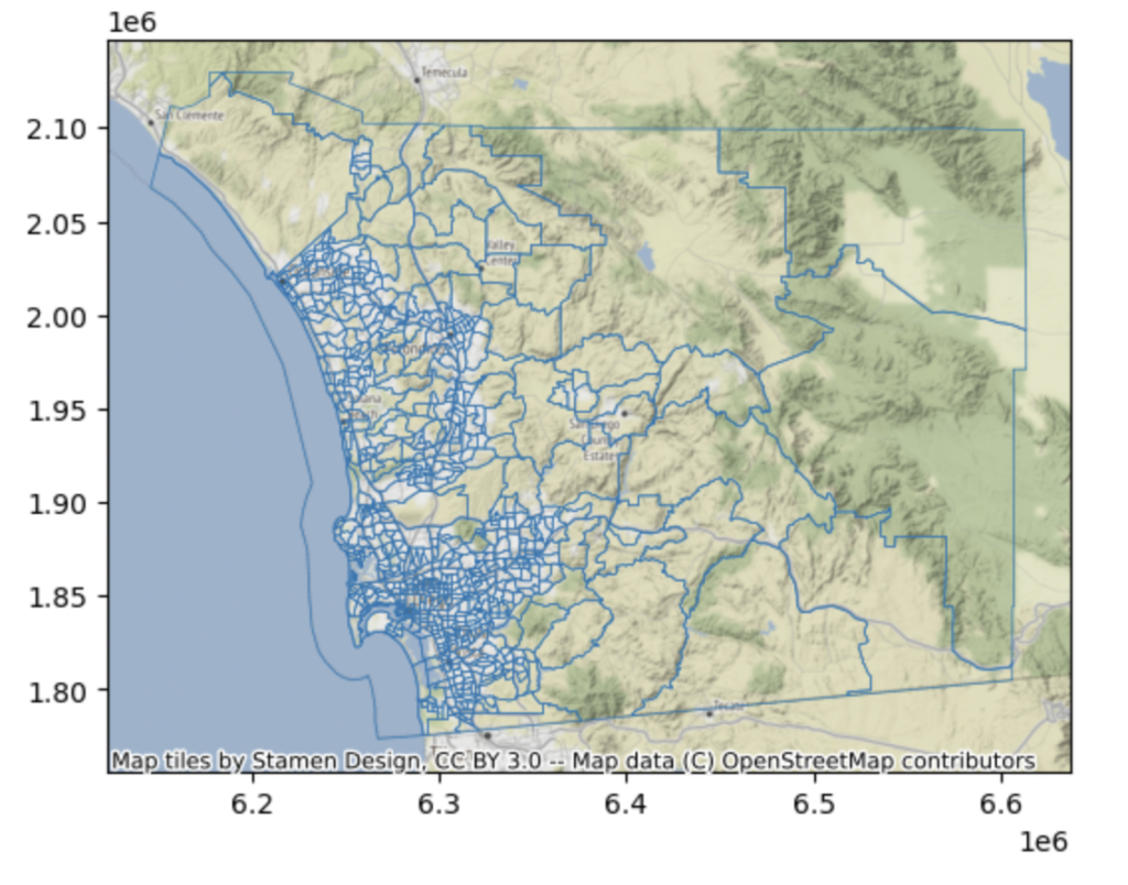
Next, we obtain the U.S. Census Tract Shape files. The U.S. Census Bureau defines a census tract as “having a population size between 1,200 and 8,000 people, with an optimum size of 4,000 people. A census tract usually covers a contiguous area; however, the spatial size of census tracts varies widely depending on the density of settlement. “
Tract shape files are necessary because they allow us to locate each listing within the appropriate tract, which will facilitate our future data augmentation efforts. The census tract shapefile data was downloaded from here.
The State FIPS code for California is 06. The county FIPS code for San Diego County is 06073. This allows us to zero in on the right tract for our project.
3.3 U.S. Census Data
Next, we add a few census data variables to our analysis.
I chose the following data points as I hypothesized that they would have an influence on an Airbnb’s nightly rate:
- total population size
- median income
- median house price (ask amount)
3.4 Open Street Maps Data
I would hypothesize that a key indicator of a home’s rental price is its location to certain amenities or destinations. To help test this hypothesis, I calculated each home’s distance to the following major tourist attractions in San Diego:
- Balboa Park/San Diego Zoo
- Gaslamp Quarter
- La Jolla Cove
- Belmont Park
To obtain the distance to a point-of-interest (POI), we would need the road network. Fortunately, this is available via Open Street Maps (OSM). Open Street Maps is a community-sourced map database freely available to the public. I tend to think of it as Google Maps + Wikipedia combined.
4. Data Prep
Having ingested the relevant data, it is now time to clean the data and then blend it together.
4.1 Census Data Cleanup & Tract Join
For each added variable, we carry out the following standard clean up steps:
- remove the extraneous header
- select only the necessary columns
- rename columns to make them easier to understand
- reset the index
- clean up the population total column and change it to a numeric type.
Since there are missing values (nulls) present in the median home value column, we will need to impute a value into them. Let’s use the median home value as the imputation value. This is $595,600 in our dataset.
After cleanup, we must first join all the three added data sources together into a single Pandas dataframe. This is done via a standard (inner) join on GEOID. GEOID is unique identifier of each census tract file.
Finally, we can join the unified Pandas dataframe containing the census tract shape data (stored in a GeoPandas dataframe). We will do via a left join (tracts geo-dataframe as the base table) as we are enriching the census tracts with supplemental census information. This preserves the final output as a GeoPandas dataframe as desired.
4.2 Listings + Census Spatial Join
We now have a geopandas dataframe that contains not only the census tract shapes, but also a few variables with census information such as home value, income, population totals, etc.
Our final step is to add the Airbnb listings information. We can do this via a spatial join between the Airbnb listings GDF (geo-dataframe) and the augmented census shape GDF. As a reminder, each row in the Airbnb listings GDF represents an Airbnb listing while every row in the augemented census GDF represents a census tract with associated metadata. The key geographic entity in the Airbnb listings GDF are Points (each Point representing a Airbnb listing), and the chief geographic entity in the census GDF are Polygons (each Polygon representing a Census tract). The spatial join operation with the Airbnb listings as the left table simply matches each Airbnb listing to its corresponding census tract. At last, we have our analysis table consisting of the Airbnb listings and their corresponding census tract and census data.
4.3 Feature Engineering
I now conduct some feature engineering. I hypothesized that a key factor influencing a home’s rental price is its location to certain amenities or destinations. To help test this hypothesis, I calculated each listings’s distance to the following major tourist attractions in San Diego:
- Balboa Park/San Diego Zoo
- Gaslamp Quarter
- La Jolla Cove
- Belmont Park
To obtain the distance to a point-of-interest (POI), we would need the road network. Fortunately, this is available via Open Street Maps (OSM). Open Street Maps is a community-sourced map database freely available to the public. I tend to think of it as Google Maps + Wikipedia combined.
5. Exploratory Data Analysis
To take stock of all the data prep, augmentation, and feature engineering, we have conducted so far, let’s re-acquaint ourselves with the data through some Exploratory Data Analysis (EDA).
- Our dataset contains 14,188 rows (each row represents a listing) and 24 columns (which represent characteristics of the Airbnb)
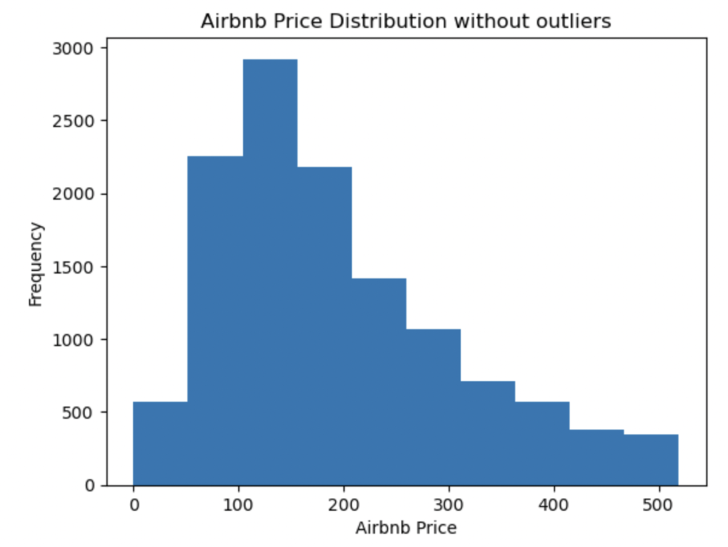
Moreover, the Airbnb price distribution is mostly right skewed and outliers are present. This will make later modelling difficult, so it is best to remove these outliers now. I used the 1.5*IQR rule to eliminate outliers, where IQR is the interquartile range.
Looking at the most common categorical values in the host name, neighborhood, and room types variables, we can see that:
- Vacasa California is a very common host. It appears to be a company.
- Mission Bay has by and large the most number of listings, followed by Pacific Beach & La Jolla.
- Most Airbnb’s provide the entire home/apt for rentals.
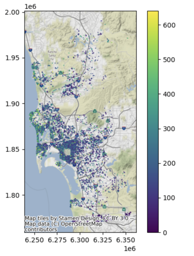
Next, we have a look at the spatial distribution of Airbnbs along with their associated rental price. It is immediately apparent that coastal airbnbs right on the Pacific Coast are more expensive than interior Airbnbs.
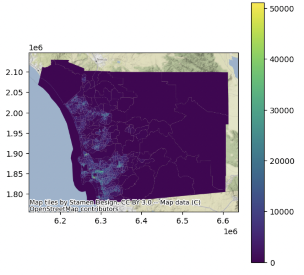
We can also explore how San Diego county’s population is geographically distributed. It is immediately clear that San Diego’s interior is mostly depopulated.
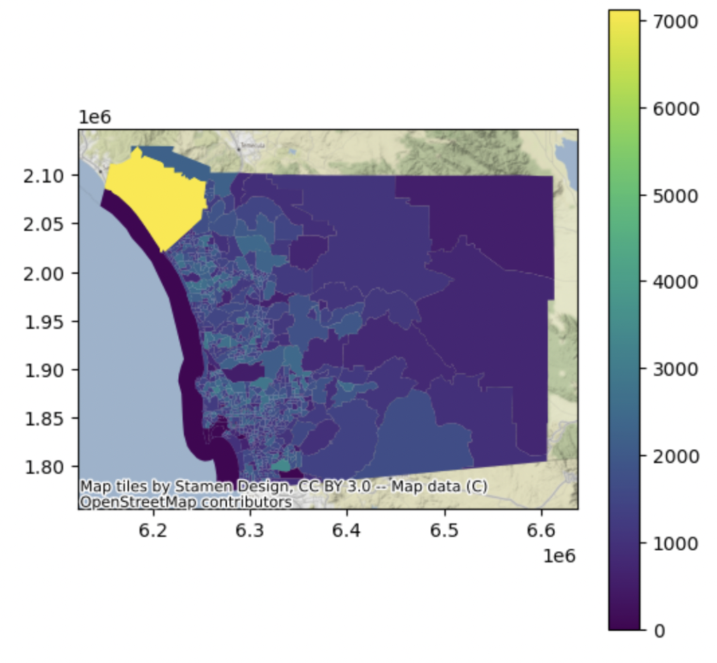
Let’s investigate the median income for each of San Diego County’s tracts. Of particular note, these is a northwestern tract that is immensely affluent.
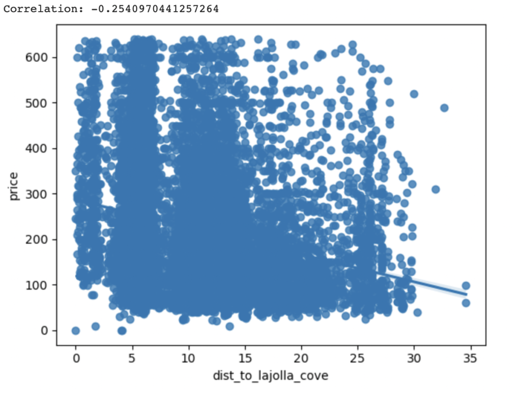
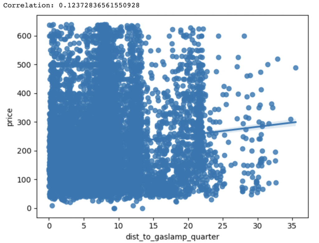
Finally, let’s investigate how an Airbnb’s proximity (or distance) from a point of interest (POI) affects its pricing. As expected, in our example, proximity to La Jolla Cove places a premium on Airbnb prices. Thus, the closer the property to La Jolla Cove, the higher the Airbnb’s price. Distance to La Jolla Cove is negatively correlated with an Airbnb’s price. (r=-0.25)
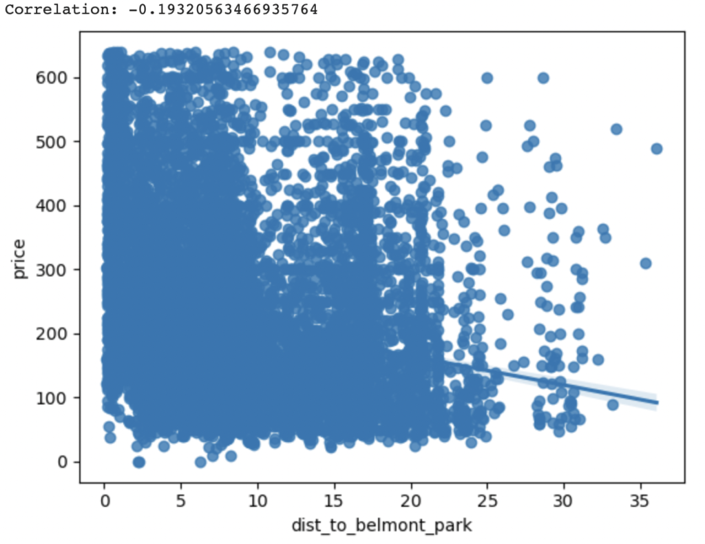
The same pattern also holds true for Belmont Park. The closer the Airbnb is to Belmont Park, the higher its rental price in our sample. (r=-0.19)
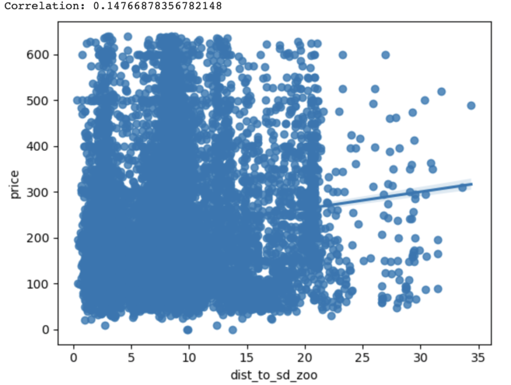
However, the pattern breaks down for San Diego Zoo (r=0.15) and Gaslamp Quarter (r=0.12). Proximity to these POIs decreases an Airbnb’s prices in our sample. One conjecture might be that, perhaps, this is because Airbnbs located in neighborhoods close to these POIs are unsafe?
6. Clustering Analysis
We can now move onto to the data analysis part of the study. To begin with, let’s carry out a clustering analysis. The objective of this analysis is to identify groupings of Airbnb’s in the hopes of getting an insight into the dynamics driving Airbnb positioning. This insight can help our (hypothetical) client gain insight into underserved regions that are ripe for a new market entrant.
However, since clustering relies on the data existing in a planar space, it is necessary to project the data from the current spherical coordinate reference system (CRS) to a planar CRS. We are currently using EPSG:4326 (spherical coordinates); let’s project the data onto into the planar CRS codified by EPSG:2230. EPSG 2230 is a CRS provided by NAD83, which is the horizontal and geometric control datum for the United States, Canada, Mexico, and Central America. NAD 83 was released in 1986. It is appropriate for California Zone 6, which is the region under which San Diego County falls under. The linear dimensions are in feet. Let’s also take a 50% sample of our data to speed up the clustering algorithm.
Before running the algorithm, let’s briefly look at the Airbnb distribution. By visually inspecting the distribution of Airbnbs, we should expect some clustering around the center region.
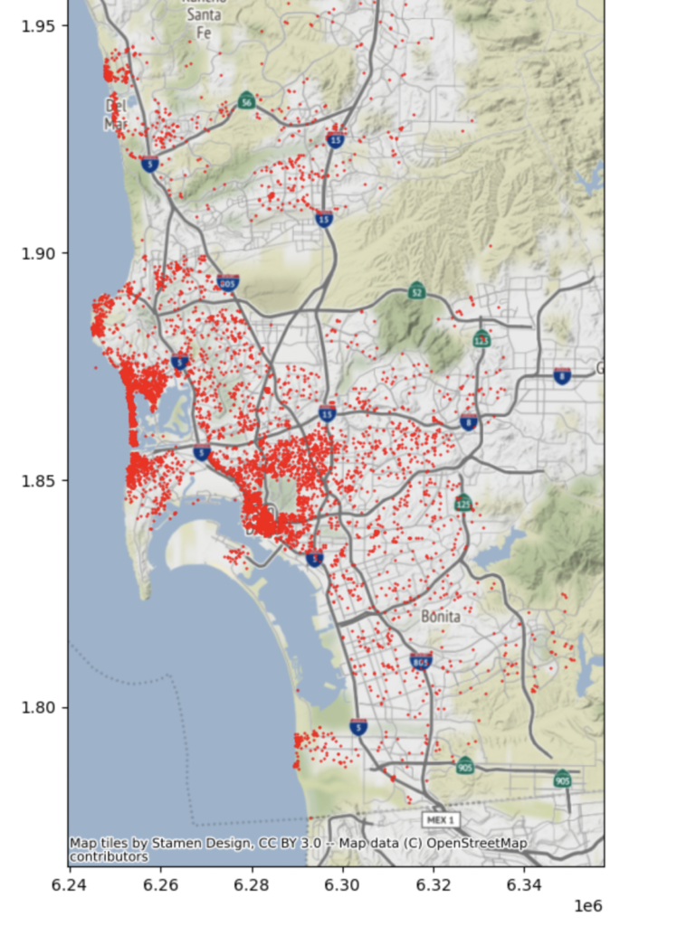
I used the ADBSCAN algorithm as the clustering algorithm and played around with the following key parameters before arriving at reasonable clusters:
- EPS = 5280 (max radius in feet to include points within the same cluster)
- MIN_SAMPLES = 61 (minimum number of listings that need to be present in a cluster)
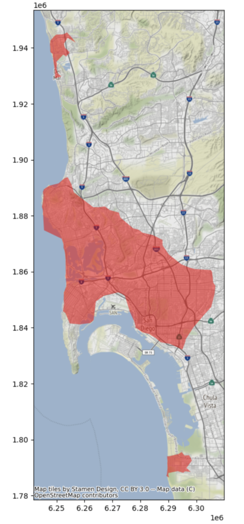
By visualizing the clusters, we can see that there are mainly 3 clusters:
- Central Cluster: Consists of properties near the Pacific Ocean as well as those on the San Diego Bay and the interiors
- Upper Coastal Cluster: Properties on the coast towards the northern extremities of San Diego County on the coast
- Lower Coastal Cluster: Properties on the coast near the Mexican border
We can color each property by its cluster membership to get a more expansive view into the clusters. (cyan = northern coastal cluster, red = central cluster, pink = southern coastal cluster, blue = “catchall”/unassigned cluster)
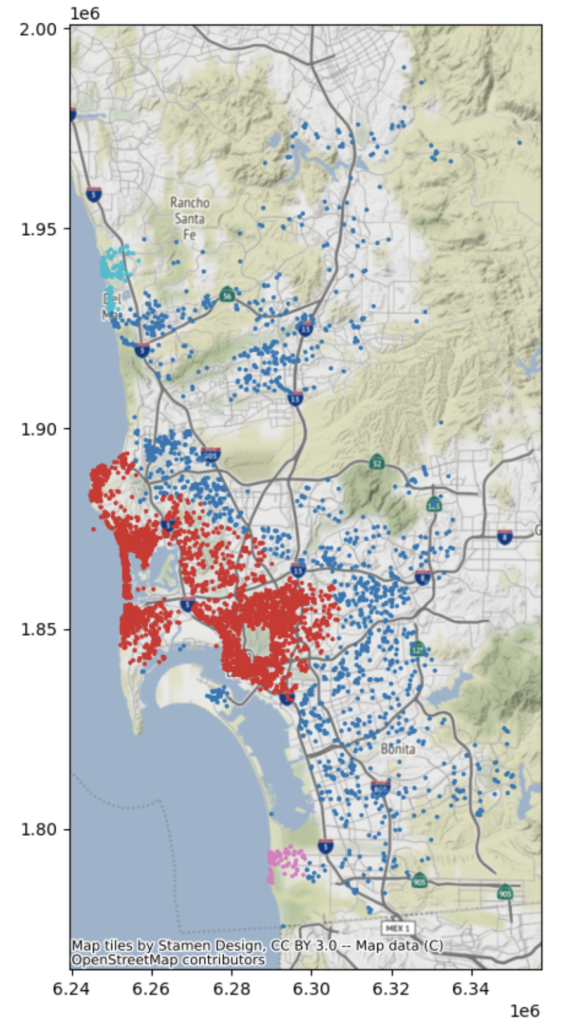
The interior listings could also be said to constitute their own cluster (the “interior cluster”)
7. Hot Spot Analysis
After having considered the dynamics driving Airbnb positioning, let’s conduct a hotspot analysis for Airbnb pricing. We’ll use Global Moran’s I to detect global spatial autocorrelation. For local spatial autocorrelation, let’s use the Local Moran’s I and the Getis-Ord GI* local statistics.
7.1 Global Spatial Autocorrelation
To encapsulate the structure of the Airbnb, we need to compute a spatial weights matrix. I used a k-nearest neighbors weights matrix where k=50. I then standardized the weights matrix using row standardization. I selected the k (number of neighbors) to be 50 since that resulted in one single component rather than mutliple disconnected components. The dependent variable (y) was the Airbnb’s nightly price.
The Moran’s global I is 0.21, thus indicating that there is some positive spatial autocorrelation in the data. This menas that Airbnbs with high prices tend to be clustered close to each other, and Airbnb with low prices also tend to be nearby each other. The Global Moran Plot confirms this. Moreover, our I statistic is significant after considering the statistic’s sampling distribution.
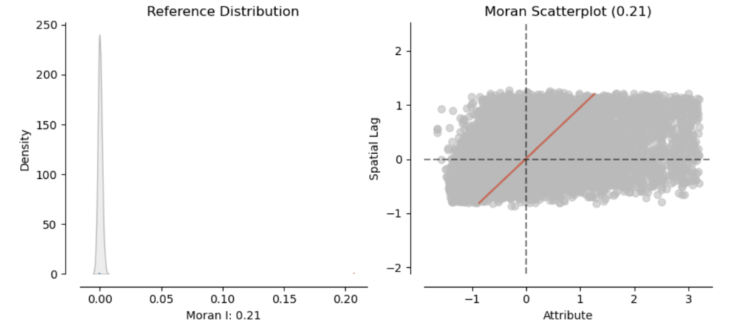
In summary, there is a somewhat strong positive spatial autocorrelation (0.21) based on the Global Moran’s I. Thus, it makes sense to now proceed with investigating the local autocorrelation via the Moran’s Local I and the Getis-Ord* local statistic.
7.2 Local Spatial Autocorrelation
Let’s begin with the Local Moran’s I statistic. We can immediately see that there are significant hotspots (high priced Airbnbs in similarly high priced neighborhoods) in red, cold spots (low priced Airbnbs in similarly low priced neighborhoods) in dark blue, “diamonds in the rough” in orange (high priced Airbnbs “standing out” in low priced neighborhoods), and doughnuts in our data in light blue (low priced Airbnbs “standing in” highly priced neighborhoods). Geospatial data scientists give each of these cases a shorthand, which respectively are high-high (HH), low-low (LL), high-low (HL), and low-high (LH). It is important to note that neighborhood here doesn’t refer to neighborhoods in the traditional sense (i.e. San Diego’s neighborhoods), but rather neighborhoods based on the spatial weights matrix.
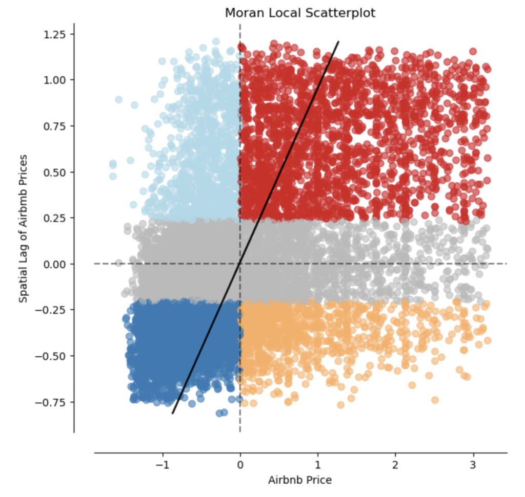

Since computing a Local Moran’s I can sometimes give extraneous information regarding “diamonds in the rough”/HL and “doughnuts”/LH, we often resort to the Getis-Ord GI* local statistic, which focuses on the HH and LL exclusively.
However, before computing the GI* local statistic, it is necessary to convert the spatial weights matrix to a binary format.
We can clearly see that there are hotspots (RED) in the coastal region (i.e. clusters with high prices), and cold spots (BLUE) in the inland regions (i.e. clusters with low prices).

8. Satellite Imaging
Lastly, to round off our study, let’s superimpose our analysis results onto satellite image data of San Diego. This would allow us to add additional context regarding how the natural environment and greenery might influence Airbnb pricing. We obtain imaging data from the landsat-8 satellite.
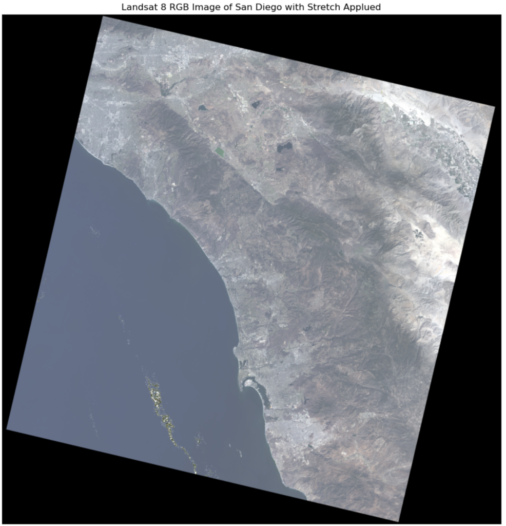
Now, we can take this one step further and highlight vegetation using a FCC (false color composite) image using the NIR (near infrared band). The advantage of using such FCC images is that areas of dense vegetation are highlighted in RED.
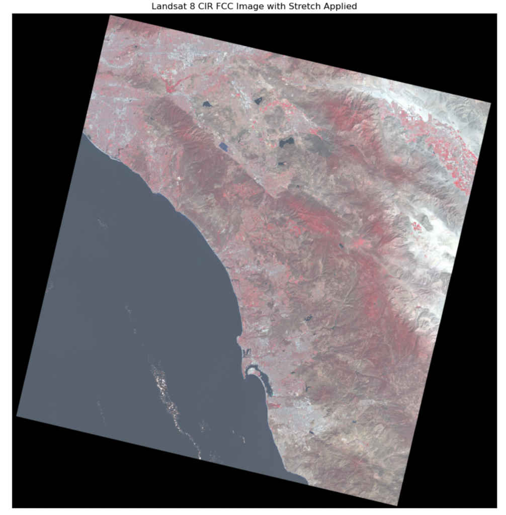
And finally, we can overlay our hotspot analysis results onto the satellite imaging data from above. However, before doing so, it is important to re-project our Airbnb listings dataframe to EPSG:32611 which is the CRS used by the Landsat-8 imaging satellite. Below, we have overlaid the hotspot analysis results onto both the natural color and FCC satellite images.
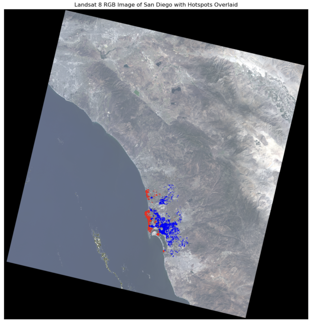
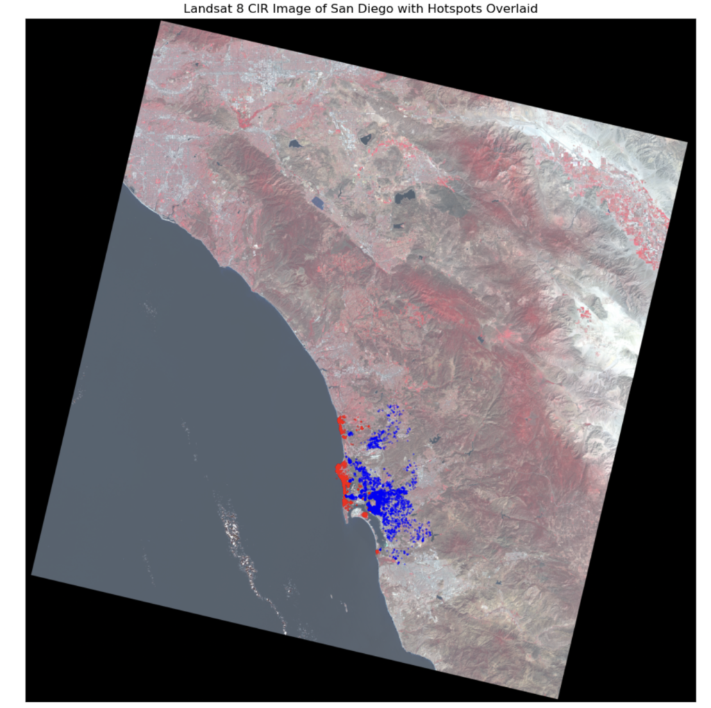
While we can see dense vegetation towards the interior of San Diego County, it is not immediately clear how vegetation/greenery affects Airbnb prices based on the above plots.
9. Conclusion
We carried out an exhaustive analysis above utilizing multiple tools from the geospatial data scientist’s toolkit. At a high level, we carried out the following tasks:
- Ingesting the Airbnb listing data,
- Augmenting it with census information,
- Feature engineering distances to POIs using Open Street Maps Road Network
- Carrying out a geospatial-focused EDA to improve our understanding of the data
- Conducting a clustering analysis using the ADBSCAN algorithm to understand the geographic distribution of Airbnbs
- Doing a Hotspot Analysis to identify outliers and clusters in terms of Airbnb pricing
- Incorporating satellite imaging data to investigate how nature/greenery affects Airbnb prices in San Diego County
However, to interpret our findings in light of the client problem, we uncovered the following insights. As a reminder, our client is a startup looking to enter into San Diego’s short-term rental market, and evaluate how it might compete effectively with Airbnb.
- Coastal Airbnb clusters have higher prices than interior/inland clusters. Furthermore, being close to La Jolla Cove and Belmont Park is associated with higher nightly rates. Our client should acquire a few listings near both these POIs in addition to other coastal properties so that they can target high-end customer segments. Since these customers are willing to pay more, our client can receive higher revenues from listings on their platform.
- Distance to POI is not equal for all: being closer to San Diego Zoo and the Gaslamp Quarter actually is associated with lower prices. Since our startup client is a new entrant into the market, it might makes sense to enter into these regions as prices are lower here, and thus volume may be higher.
- The upper coastal region and lower coastal region clusters seem underserved; these might be core niche markets that our client can tap into as they seek to get a footprint in the short-term rental business. The central cluster has the most existing Airbnb listings, so it might already be a saturated segment.